The quality of air around the world is deteriorating, it is a well-known fact, and still too few people acknowledge it as the need of the hour. This article explains how Murmuration contributes in helping to combat this issue. Murmuration is a French SME created in March 2019 with the aim of introducing the environmental dimension into the decision-making cycle, focusing on tourism management institutions and stakeholders. We are using mainly earth observation satellite data, mixed with in-situ and socio-economic data.
Murmuration has developed ready-to-use indicators based on the prior mentioned data sources. Among them, the air quality indicator aims to provide insights on the evolution of major air pollutants across the globe for comparison and evaluation purposes. The indicator follows standards for data production and dissemination, such as the Open Geospatial Consortium (OGC) standards. It makes it ready to use for most of the client applications. The main objective is to help policymakers and other stakeholders identify problems at their root so that actions can be made accordingly.
The quality of air has been deteriorating since the beginning of the industrial revolution. Toxicity of the air is higher than ever before. In order to control it, it has to be monitored systematically. To do so, the World Health Organization started to establish Air Quality guidelines in 1987 to define safe levels of the air pollutants. The latest revision published in September 2021 defines six compounds as the primary air pollutants because of their significant effect on human health. It includes 4 gases (NO2, SO2, CO and O3) and 2 dust particles (PM2.5 and PM10). Each of these compounds affect human health in several different ways.
Through its air quality indicator, Murmuration aims at helping even non-experts understand the situation. The indicator studies air pollution at the level of individual compounds as well as an aggregated score including all pollutants.
The nature of the indicator and the algorithms used are explained in the following sections. The data used for computing the indicator comes from the TROPOMI instrument of the Sentinel 5P satellite.
But why using satellite data when air pollution has been monitored using ground sensors for a long time? The conventionally existing measurements based on in-situ sensors are very local to the region of measurement (say 50 m). This cannot be used to monitor the whole city unless these in-situ sensors are installed in every place in the city. But, it is a very costly process and has to be maintained consistently.
This is the place where satellite data comes to play. Even though there is a tradeoff with the spatial resolution, the data helps studying the air quality at the city level. Satellites monitor air quality at a much cheaper cost, in a scalable way (once launched and flying, it can monitor many cities with no additional cost) and are producing measurements that can be compared from one city to another making it a very good tool for evaluating and benchmarking cities with each other.
Sentinel 5P is the first sentinel satellite to monitor the atmospheric composition. The instrument measures solar light in the ultraviolet and visible, near-infrared and shortwave infrared spectral bands. The light is split into different wavelengths using a grating spectrometer and they are captured accordingly by four different detectors to measure the level of different compounds.
The raw data from Sentinel 5P is then processed, validated, georeferenced and made available for ease of access through Copernicus Atmosphere Monitoring Service (CAMS). The processed and validated data for all of the 6 above mentioned compounds are used to calculate the indicator. The 6 individual compounds are available every day at an hourly level. Daily levels are then computed with aggregation algorithms reflecting the health impact (short term or long-term ) of each pollutant (based on WHO guidelines). The aggregated data is then fed over a data transformation pipeline to be converted to the desired format.
The aggregated air quality indices are calculated at 2 different temporal levels – yearly and daily. Two different algorithms are used to arrive at the indices :
The indexes are defined at two different coverages – European and Global. This is the result of availability of raw data of Global coverage at 0.1 ° (appx. 100 km near the equator) spatial resolution and raw data of European coverage at 0.01 ° (appx. 10 km near the equator) spatial resolution. The raw data for European coverage are readily available as mass concentration in µg/m3 which is the standard used by WHO to evaluate air quality levels. On the contrary, the raw data for global coverage is not readily available in the standard format.
In the global coverage data, dust particles such as PM10 and PM2.5 are available as mass concentrations in kg/m3 which can be converted using a conversion factor. But the gases like NO2, SO2, CO and O3 are available in mass mixing ratio in kg kg-1. They have to be converted to mass concentrations using ideal gas equations. Finally, all the gases and dusts are available in mass concentrations with the same unit µg/m3.
At the end, Murmuration’s Air Quality Indicator can be used from 2 channels that Murmuration is providing:
While the map service takes care of studying the distribution of various compounds and its hotspots, the programmatic interface helps in narrowing the study to any particular area of interest and to study the change over a temporal scale.
The indicator helps in identifying problems such as pointing out regions or times of high pollution or temporal range of high pollution exposure. The World Health Organization estimates that air pollution causes 7 million premature deaths per year. This is one of the biggest environmental threats to human life. By finding out regions of concern, appropriate actions and measures can be taken by government bodies, enterprises and non-governmental organizations to mitigate the situation.
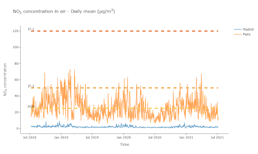
(Graph of NO2 concentration in the air in Paris and Madrid, ©Murmuration)
The above chart shows the Murmuration NO2 indicator and its evolution in Madrid and Paris over a three-year time frame.
Thanks to the indicator developed by Murmuration, it is possible to study the air quality level at the city level in a cost-effective manner. Monitoring air quality using satellite measurements will not completely replace the in-situ measurements. They act complementary to each other. While satellite measurements help in monitoring air quality at city level or higher, in-situ measurements help in monitoring air quality at street or neighborhood level (hospitals, schools, parks etc.).
This article is one among many that will be published until the end of March, explaining what Murmuration’s indicators are and their purposes.
Author : Murugesh MANTHIRAMOORTHI, Remi NASSIRI
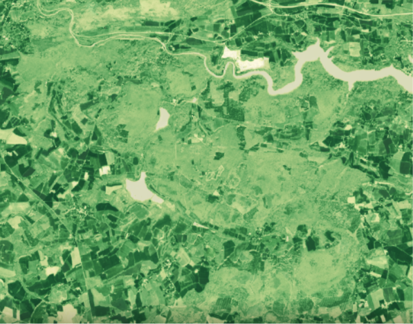
In metropolitan France, forests cover 31% of the territory, i.e. nearly 17 million hectares. The importance of vegetation cover as a lung for the animal kingdom is well known. But all over the world, these green treasures must meet the ecological and social challenges of tomorrow. In particular, to address climate change, strategies must be put in place for the sustainable management of forest ecosystems and the maintenance of forest health.
In February 2021, in France, a petition was launched to stop the cutting of trees in the forests of the Sénart region. The movement is gaining momentum, and the NOF (National Office of Forests) must explain the management of vegetated areas and their sustainability
(Forest, ©Canva)
This article aims to provide a better understanding of this problem and the issues at stake. It also shows the role that technological and scientific progress can play in better understanding the causes and consequences of forest health degradation in threatened regions.
The concept of a healthy forest has universal appeal. However, forest ecologists and managers are struggling to define this concept exactly. Thus, to date, there is no universally accepted definition for forest health.
Most definitions of forest health can be classified according to their ecological or utilitarian perspective. From an ecological perspective, current understanding of ecosystem dynamics suggests that healthy ecosystems are those that are able to maintain their organisation and autonomy over time while remaining resilient to stress ([1] Edmonds et al 2011, [2] Raffa et al 2019).
On the other hand, the utilitarian perspective holds that a forest is healthy if management objectives are met. Consequently, a forest is unhealthy if these objectives are not met. This definition may be appropriate when there is a single, unambiguous management objective, such as timber production or the maintenance of wilderness attributes. It is, however, too narrow when multiple management objectives are required.
Finally, other forest ecologists incorporate both ecological and utilitarian perspectives into their two-part definition of forest health. First, healthy forest management should be based on its intrinsic physical properties (size, elevation, climate). This includes matching basic tree mortality to observed mortality. Secondly, a healthy forest should meet the objectives of the owner/government, provided that these objectives do not conflict with sustainability ([3] Teale and Castello 2011).
Interestingly, forest health is often defined from the “natural” perspective of the forest, or from the perspective of forest managers. We are therefore in a position to ask the questions: what are those management actions that aim to improve forest health? And why simply leave the forests untouched, which intuitively seems to be the best solution?
In 2019, the Food and Agriculture Organisation of the United Nations (FAO) is setting the guidelines for what is intended to be sustainable forest management. In view of the numerous forest fires, too devastating for ecosystems, a strategy was needed. This document, “Fire-smart forest management”, describes the methods, regulations and indicators used to perfect the remedy for poor forest health.
Among these standards are explanations of how to cut down old trees. And so a wave of tree cutting begins. A wave that could be mistaken for deforestation. Indeed, the uninformed walker is indignant to see trunks littering the ground of his favourite forest. However, here are the explanations needed to understand this measure.
One of the main causes of poor health of forest areas is an excess of trees and especially an abundance of trees of the same age. Firstly, too many trees per square metre means that there is little light. This results in few flowers and low vegetation and ultimately very little diversity. The soils under these forests are also of poor quality, lacking in bio-organisms.
We now know that the diversity and cyclicality of ecosystems often make them sustainable. The second point related to the abundance of old trees is fires. Forest fires are not bad in themselves. They have been part of the sustainability of ecosystems since long before man. However, in our case, if a fire breaks out, everything is lost. The soil is no good, nothing will grow back for a long time: the cycle is broken, sustainability is restricted.

(Unhealthy forest, What is a Healthy Forest ? , ©Jeffco Open SPace, Youtube)
Thus, these two arguments together justify cutting down thousands of old trees and planting new growth. Having a difference in the age of the trees leads to a lower risk of forest loss by fire and less fire in general. Fewer trees brings more diversity. It provides more space for animals and other forest dependents (mosses, flowers, low vegetation). All of these cascading implications result in better soil condition, and thus possible renewal, in other words: a sustainable ecosystem.

(Healthy forest, What is a Healthy Forest ? , ©Jeffco Open SPace, Youtube)
However, assessing the need for and strength of management actions in an area of interest is not an easy task. To achieve this, ecologists and forest rangers are now using computer tools. They allow to quickly visualise these areas as well as the sources of the problems.
More than ever, it is necessary for environmental decision-makers to use new computer technologies. They allow the observation, understanding and prediction of multiple changes in regions of interest. At Murmuration, as at many other environmental and IT consultancies, satellite images are the main source of this data. In Europe, the Copernicus environmental observation programme has enabled the use of such images through the launch of the Sentinel satellites. Sentinel-2, in particular, has been given the task of providing European countries with comprehensive and up-to-date data for environmental monitoring and surveillance. For the issue of forest health, three main indicators are derived from the processing of these images: NDVI, LAI and FAPAR.
The Normalized Difference Vegetation Index (NDVI) is a simple graphical indicator. It can be used to analyse remote sensing measurements. Often based on a spatial platform, it assesses whether or not the observed target contains living green vegetation.
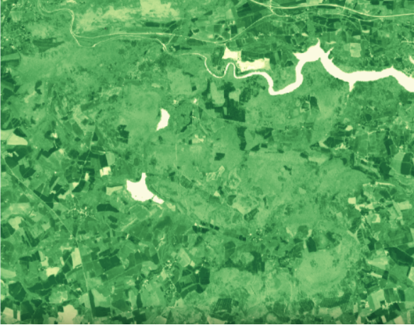
(NDVI of a forest in Bretagne, France in March 2021, 10mx10m resolution)
The Leaf Area Index (LAI) is a dimensionless quantity. It expresses the leaf area of a tree or ecosystem per unit area of soil. It is determined by calculating the total leaf area of the plant on the soil surface it covers.
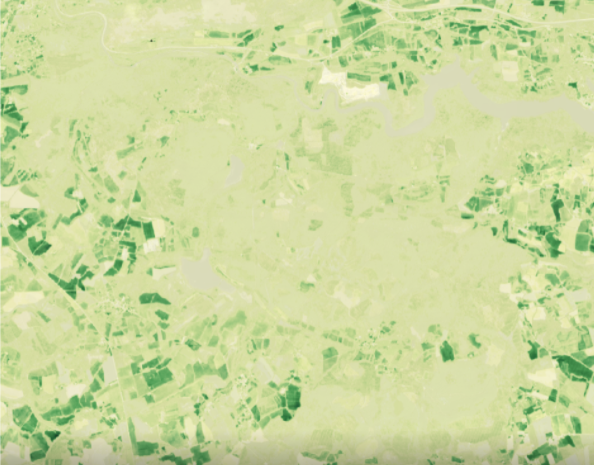
(The LAI of a forest in Bretagne, France, in March 2021 at 10mx10m resolution)
FAPAR is the fraction of solar radiation entering the spectral region of photosynthetic radiation that is absorbed by an organism. This biophysical variable is directly related to the productivity of photosynthesis. Some models use it to estimate the assimilation of carbon dioxide in vegetation. As seen previously, this carbon assimilation is very important for understanding the participation of the area under consideration in global gas exchanges.
(FAPAR of a forest in Bretagne, France, in March 2021 at 10mx10m resolution)
Thanks to these satellite images, it is possible to visualise the evolution of ecosystems. This makes it possible to conceptualise the actions to be taken. It is by considering these indicators that the management of forest areas can be done effectively.
Forests are the lungs of the Earth, they are also the terrestrial receptacles of plant and animal biodiversity. Yet there is a lack of information on their management, whether in France or elsewhere. Contrary to what one might think, leaving a forest alone is not always equivalent to helping it.
At Murmuration we use these environmental indicators to go one step further. Indeed, the jointness and correlation between these variables and other indicators, both ecological and social, allow us to highlight the impacts of humans on biodiversity and the evolution of a vegetated region. Once highlighted, these issues are intended to be the arguments for tomorrow’s decisions.
[1] – Edmonds, R.L.; Agee, J.K.; Gara, R.I. 2011. Protection et santé de la forêt.
[2] – Raffa, K.F.; Aukema, B.; Bentz, B.J. [et al]. 2009. Une utilisation littérale de la “santé des forêts” permet de se prémunir contre les abus et les mauvaises applications. Journal de pratique forestière.
[3] – Teale, S.A. ; Castello, J.D. 2011. Le passé comme clé de l’avenir : une nouvelle perspective sur la santé des forêts.
Authors : Mael Plantec, Remi Nassiri
As a UNICEF report reminded us this summer, the lack of water in some parts of the world is having serious consequences for people. This lack of access to water for populations is commonly referred to as “water stress”.
Today, several regions of the world are suffering from water stress. According to the World Resource Institute, 17 countries have an “extremely high” probability of water stress. These include India, Mexico, parts of China and, above all, most of the Near and Middle East.
This article aims to provide a better understanding of this problem and the issues involved. It also shows the role that technological and scientific progress can play. They will allow better understanding of causes and consequences of water stress in threatened regions.
The lack of water for populations can result from political and social causes: waste of available resources, mismanagement, conflicts. This makes it impossible for entire populations to access water. But it is also linked to economic problems of resource distribution and the uses addressed.
Finally, water scarcity is also and above all the result of physical causes, indeed, in the desert there is generally a lack of water, whatever the management policy put in place.
If the focus is on these physical aspects of the problem, the concept of water stress can be summarised in a few simple and understandable equations:
Reserves = groundwater + surface water + precipitation
Consumption = agricultural use + industrial use + domestic use
Water stress=Consumption/Reserves
Water stress is therefore the ratio between consumption needs and water reserves. If the need exceeds the quantity of water available in a given area, then that area is under water stress. The need includes all the uses of water: agriculture, industry and current consumption of the populations. Availability includes accessible renewable water reserves: surface water (lakes, rivers, etc.), groundwater and rainfall. The higher this water stress ratio, the greater the competition between uses and the greater the need for informed arbitration.
The need to arbitrate between different water uses requires effective monitoring tools. Observing both the state of available reserves and the level of consumption. Water stress indices are being developed for this purpose. One example is the initiative of the World Research Institute, a non-profit scientific organisation based in Washington. WRI researchers have developed a water stress monitoring index and an online platform to disseminate this information.
The following illustration, taken from this platform, highlights the situation in the Near East. The region, once known as the “fertile crescent”, saw the emergence of agriculture more than 5000 years before our era. Today, it is one of the most water-stressed regions on the planet.
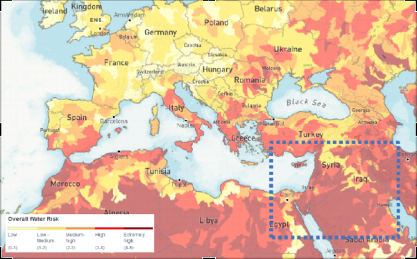
(WRI Water Stress Index Map of Europe and the Middle East, 2019)
These means are first of all extremely useful for better quantifying the available resources. Large-scale monitoring of surface water, for example, is addressed by the SWOT satellite, which will be launched jointly by CNES and NASA in 2022. This programme will make it possible to obtain consistent time series that are essential for current resource management. In addition, the monitoring of extreme events such as droughts or floods will be carried out. The Copernicus programme and its Sentinel satellites also monitor important water cycle variables such as evapotranspiration and soil conditions. In particular, the moisture in the top few centimetres of soil can be measured by the radar sensors on Sentinel-1. This is an important indication for understanding the infiltration of precipitation into the soil and modelling the state of groundwater resources.
Spatial data is also a great tool for assessing consumption needs. Large-scale land use and segmentation information from space-based observations is an indispensable basis. Sentinel satellites, for example, allow precise identification of crop type, and thus improve water use models for agricultural needs. Domestic needs can also be modelled on a large scale using urbanisation monitoring information.
These modern means of observing our planet will make it possible to set up a large-scale water stress indicator. It will be less dependent on local in-situ data that are sometimes difficult to acquire. The use of this type of data should also make it possible to obtain an indicator with a high update frequency. The revisit period of a given geographical area of the satellites considered (between a few days and a month) should make it possible to set up an indicator capable of better capturing the dynamics and evolution of water stress over time.
The integration of space observation as a tool for combating water stress therefore seems promising. It allows the monitoring of surface water, the modelling of underground resources and a better understanding of consumption. As a result, it has a real role to play in planning access to water.
This tool was actually used in 2004 during an operation in Darfur (Chad). Space observation made it possible to propose a map of the possible groundwater available in a region hosting numerous humanitarian camps. The camps were then able to use this information to set up their camps and dig wells. In this way, they are making it easier to access water.
It should be noted that at that time this international initiative used data provided by Japanese (JERS-1), American (Landsat) and European (ESA’s ERS-1 and ERS-2) satellites.
Today, the Sentinel fleet (in particular the Sentinel-1 radar tools) and the mass of free and open data that the Copernicus services produce thanks to them are favoured and should make it possible to move this type of use from research to operational services.
Authors : Fabien Castel, Rémi Nassiri
The IUCN (International Union for Conservation of Nature) stated that “plastic pollution is the most widespread problem affecting the marine environment”. Most of this pollution ends in the plastic oceans.
Plastics take centuries to degrade and contaminate the entire food chain. Each year, up to 13 million tons of plastic end up in the oceans because it is not recycled. Current estimates indicate that there is about 150 million tons of plastic found in the ocean. In 2018, the UN environment program placed the issue of plastic in the ocean among the six environmental emergencies of greatest concern.
Active methods of plastic removal are required to address this issue. Being able to detect and track plastic litters is crucial to enable these methods. There are three main approaches to track them: numerical modelling, in situ observation and earth observation satellite images.
Most of ocean plastic comes from rivers. Knowing the main points of origin and using data on ocean currents and on vertical mixing of water layers, it is possible to model the probable trajectory of plastic litter and the areas where they will stagnate and concentrate. The Copernicus Marine Service provides ocean current models that are used for this purpose.
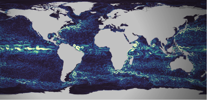
Figure 1 : Visualization of Copernicus Marine currents numerical models, extracted from https://myoceanlearn.marine.copernicus.eu/
Local measurements are regularly performed to understand and quantify the issue’s importance. With statistical processing of the collected data, these measurements campaigns allow to build and calibrate the plastic litter tracking models (see for instance van Sebille et al.).
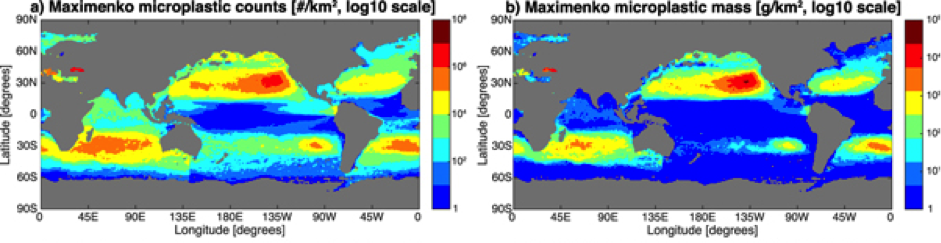
Figure 2 : Maps of microplastic count (left column) and mass (right column) distribution for one of the studied statistical models, extracted from the work of Van Sebille et al.
99% of ocean plastic lays at the bottom of oceans, whereas only 1% floats on the surface. Remote sensing from space therefore suffers from a structural limitation that will never make it a self-sufficient solution to the problem. However, with their ability to cover large et inaccessible areas, using satellite images is an innovative approach that can complement modelling and in-situ observation. While still at the research and development stage, many research groups carry out experiments. They have to work with the tools at their disposal, which are not initially designed for this task.
The European Earth Observation Copernicus program offers different options here. First is the satellite Sentinel 3, dedicated to ocean observation. It is though designed to monitor large-scale oceanic processes. Its 300 meters resolution does not make it an adequate tool for plastic monitoring.
The Sentinel-2 satellite is an interesting alternative. It provides images in the visible part of the spectrum with a 10 to 20 meters resolution. Small pieces of plastic are not noticeable. However when they aggregate into large clusters they become more likely to be detected by satellites with such spatial resolution.
Sentinel-2 has been studied as a solution to ocean plastic monitoring by many research groups (see the work performed by a group from 25 different institutions, or this work carried out by a group from the Plymouth Marine Lab in 2019). However It has been initially designed for land monitoring. While its orbit covers all the earth, images are not collected on the wide open ocean areas. Images are only available on continental coastal areas and around islands. It is still though a very interested approach showing interested results in the covered areas.
Figure 3 :Example of plastic detection on a coastal are using Sentinel-2 images. Extracted from the work of the Plymouth Marine Laboratory
Earth observation satellite programmes mainly focus on land. Coverage of the oceans is limited to the observation of global phenomena, with a relatively low resolution (~300m).
Higher resolution observations are available over coastal areas.
However, most plastic waste is deposited on the ocean floor. It is therefore not observable by satellites. Those that remain on the surface can accumulate in clusters visible from space.
Observation from space should be considered as a complementary solution. It can be used to detect plastic waste in coastal areas before it is dumped.
Earth observation is thus a useful data source for flow analysis and waste tracking models. It provides a wide and systematic spatial coverage that ideally complements the more accurate but local and punctual in-situ observations.
Finally, it is important not to stop thinking about the role of space observation in ocean pollution control. Indeed, satellites are evolving, and so are observation tools. Improved resolution could allow for more detailed observation of plastic waste in the oceans. Going from 300 m resolution to 20 m with global coverage of the oceans would be a major advance. This would make it possible to position space observation at the centre of the tools and means for sustainable action in the oceans.
Setting up this type of mission takes time, but the plastic crisis in the oceans could lead space observation down this path.
Authors : Fabien Castel, Rémi Nassiri
A fortnight ago, the World Health Organisation (WHO) published an update of its air quality guideline. This has not happened since 2005. Therefore, this is a major scientific and societal event. The need for air analysis to evolve in line with technological and scientific advances pushed for this intervention. Moreover they demonstrate the highly dangerous and damaging effects of poor air quality on human health.
Indeed, the WHO estimates that air pollution causes 7 million premature deaths. But it also means millions of years of lost life expectancy.
Air pollution is highly dangerous for our health and our planet. This is why the WHO has drastically lowered the air quality thresholds. Because at this level, they reveal the danger of elements present in the air, even in smaller quantities.
This intervention also sounds the alarm. Thus, the international organisation alerts the authorities for the need to act more quickly and effectively against air pollution.
Air quality has a direct impact on human health (UN Sustainable Development Goal 3, Good health and well-being). In addition, it has serious consequences for the environment in general (UN Sustainable Development Goal 15, Life on Earth). Various chemical compounds emitted by human activities alter this air quality.
Particularly noteworthy is fine particle pollution. This is aggravated by various anthropogenic factors (industry, heating, building sector, transport and road traffic). It causes respiratory diseases, cardiovascular problems and complications in infants.
Nitrogen oxide (NOx) pollution covers another dimension of the problem. It leads to acidification of precipitation, which alters soils and waterways, unbalancing many ecosystems. These pollutants are mainly emitted by road traffic. Moreover, they can travel long distances from their place of emission and affect sensitive ecosystems. Consequently, the limitation of these emissions in areas with heavy road traffic (i.e. urban areas) is mainly a health issue. It is not only a local one but also a global one, in order to preserve our common environment.
The thresholds defined by the WHO were lowered between the last version of 2005 and the recent update. This decision is justified by extensive epidemiological research. The results obtained on a large scale in recent years are worrying. They reveal the significant long-term impact of these pollutants, even in small doses. For fine particles, the threshold value has been divided by 2. This translates into a reduction from 10 µg/m3 in 2005 to 5 µg/m3 in 2021. For NO2, the strengthening of the directive is even more important. The threshold has been reduced from 40 µg/m3 in 2005 to 10 µg/m3, thus being divided by 4 today.
Modern Earth observation tools make it possible to monitor the concentration of pollutants in the air from space. This is made possible and accessible by the European Copernicus programme, and in particular the Atmosphere service. From observations collected by the Sentinel 5 satellite, scientists and engineers produce daily data.
These data cover the whole world. They provide an objective, high-level measure (average value aggregated over a 10-kilometre resolution grid) of air quality. They can be used systematically anywhere in the world, and are therefore an invaluable analytical tool.
Comparing, for example, the emissions of several large European cities, we can already see the differences. With the new WHO recommendations, we can see that some cities stand out. Among them, Spanish cities are among the best.
The following graph focuses on the concentration of nitrogen dioxide (NO2) in the air. Here it focuses on 4 European cities over the last 3 years. The cities are Madrid, Bilbao (in red and blue), Athens and Rome (in yellow and green). The orange line represents the WHO recommendation.
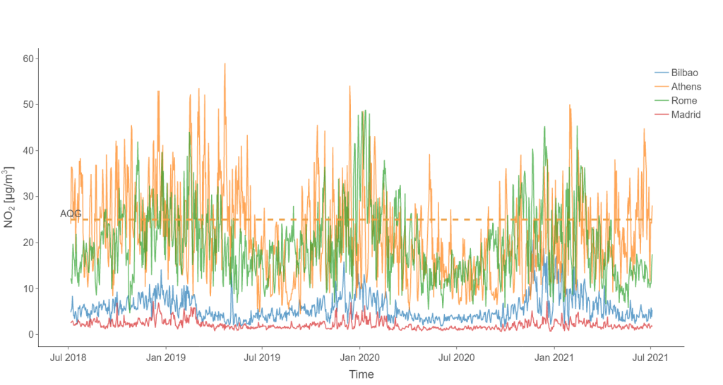
(Graphique des taux de concentration de dioxyde d’azote (NO2) dans l’air, pour les villes de Athènes, Bilbao, Madrid et Rome)
This comparison between southern European cities clearly shows the difference in NO2 pollution. Cities like Rome and Athens are well above the new WHO framework. In contrast, Madrid and Bilbao remain well below.
The situation for fine particles is relatively similar. Indeed, Madrid and Bilbao are both below the WHO thresholds. These observations are illustrated by the graph below (using the same colour code as above).
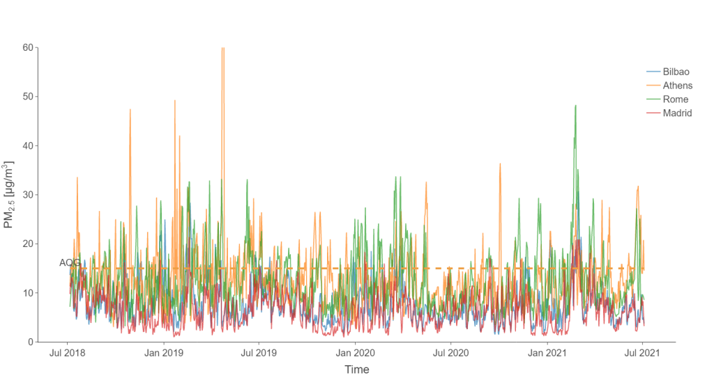
However, over the last 3 years, Madrid and Bilbao have had average levels below the limits set. As for the peaks, they remain much lower than those of the other cities. As a result, air pollution in these Iberian cities is much lower than in Rome or Athens.
So what can explain such a low level of pollution in these Spanish cities? The answer surely lies in the road traffic regulation measures taken by the cities in recent years. Madrid introduced large low-emission zones in the city centre in November 2018. In Bilbao, the speed of vehicles in the city centre has been restricted to 30 km/h since May 2018.
Finally, the data collected on site tends to prove these Spanish cities right. To demonstrate this, in-situ sensors are used. These allow the evolution of nitrogen dioxide pollution to be followed over a long period. The following curve shows the evolution of the nitrogen dioxide pollution index of the World Air Quality Index in Bilbao.
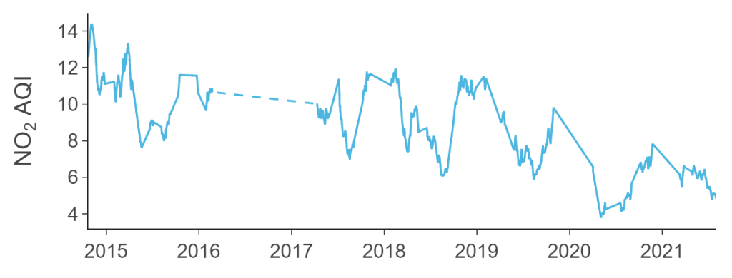
The downward trend is clear in 2020, but should be taken with caution. In this period, the health crisis also had a strong downward impact on emissions.
However, it continues strongly into 2021, which is a very encouraging sign.
Moreover, this could quickly confirm the lasting positive effect of efforts to regulate road traffic in urban areas. There is therefore great hope for the consequences and success of similar measures in other European cities.
Authors : Fabien Castel, Remi Nassiri
The Flockeo platform proposes an innovative approach : Travelers become their own guides by choosing sustainable destinations!
Our approach is inspired by the European Commission’s ETIS indicator system , developed to assess the sustainability of tourism destinations. By combining satellite and statistical data, the Flockeo indicator measures the pressure of human activities on the environment. Thanks to an interactive map, users can zoom in on the destinations that interest them and know the index of the region concerned. Through a colors rating, they will be able to easily assess the impact of human activities through four criteria: the ecosystem potential, the risks related to water and the urbanization processes.
This inclusive approach is possible thanks to satellite data. Combined with various data from local authorities or even the general public (eg tourism statistics), it is possible to envisage large-scale sustainable tourism . The satellite data are factual and invaluable because they allow to go back in time, to identify the problems but also the solutions and to foresee future evolutions.
Through this platform, our desire is to create a global ecosystem that promotes sustainable practices through the linking of all stakeholders in tourism. Whether they are hotels, travel agencies, restaurants, guides, tourist offices, national parks, associations, they need to make themselves known and make their actions visible. These are choices that require significant investment. To highlight them in our platform is our primary mission so that they can devote their time and their budgets to concrete actions.
Sustainable tourism is associated with environmental issues, but not only. It brings together all aspects of sustainable development and also concerns corporate social responsibility. For a travel professional, it’s about maintaining a “spirit of the place” that values the geographical characteristics of a destination through its biodiversity, its cultural wealth, its heritage and the well-being of the inhabitants of the place.
MURMURATION SAS joins ESA BIC Sud France, whose mission is to support the creation of companies and start-ups linked to the space sector. ESA BIC Sud France is one of the 22 incubators of the European Space Agency. Covering the Occitania-Pyrenees / Mediterranean, New Aquitaine, PACA and AuvergneRhône-Alpes regions, ESA BIC Sud France has supported, since its creation in 2013, more than 75 companies.
Space travel is not the only way to bring together “space” and “tourism”. Space can already be a powerful tool in developing appropriate strategies to fight the effects of over-tourism and to assess the environmental impact on tourist destinations.
MURMURATION SAS aims to provide B2B and consulting services for the tourism sector, including a web platform based on earth observation satellite data, Flockeo.
Combining various datasets ranging from public official tourism statistics to proprietary data, it is possible to set up environmental pressure indicators on a global scale. Indeed, the observation of a specific area using satellite data makes it possible to give reliable and transparent measures and actionable data. The satellite data is of great value, as it enables time-travel to the past to assess the situation, provide solutions and to foresee future evolutions.
The term “Murmuration” describes the phenomenon by which starlings gather spontaneously in the sky to face a potential predator.
Faced with the exponential growth of mass tourism and its negative effects on the environment, MURMURATION SAS’s approach is similar: to create an ecosystem of engaged actors in the world of tourism to better measure the environmental pressure on popular destinations and to limit its impacts, in the context of proven climate disruption. It’s all about creating the conditions for the development of sustainable and reasoned tourism!
Study the environmental impact of tourist sites,
Raise the community’s awareness to sustainable tourism
Enhance the community commitment to social and environmental actions
Copyright image ImaginEarth
MURMURATION SAS is currently working on the FLOCKEO web platform to offer travelers and travel professionals a map of the world to know the environmental impact on destinations.

The FLOCKEO barometer uses 3 essential indicators that combined satellite data with other data to evaluate the ecological footprint on tourist destinations.
The International Union for the Conservation of Nature (IUCN) is one of the world’s leading organizations dedicated to the protection and preservation of nature. The FLOCKEO barometer takes into account data from protection programs at international, national and / or regional level and also the quality controls to ensure their effectiveness.
Satellite data combined with other data sources can be used to estimate the risks related to water. The FLOCKEO barometer takes into account the quantity, the quality, as well as the existence and the relevance of the infrastructures for a better management of water around the world.
The indicator makes it possible to specify low density areas as well as very dense urban areas by combining several data, including satellite data. The FLOCKEO barometer thus guides travelers to more or less dense urban areas and creates their own “green” journey.
D-3 before the official release of the FLOCKEO website
Global warming, pollution, degradation of cultural sites, deforestation … the effects of overtourism on the environment and populations can be dramatic.
MURMURATION is one of the start-ups that has joined the acceleration program of Climate-Kic France . This program is intended for all start-up companies that are motivated and committed to solving the problems related to climate change. Thanks to Flockeo, we want to implement an inclusive approach!
Over-tourism, over-crowding of sites and the under-frequenting of other sites which, however, have put in place the necessary infrastructures are critical for travel professionals who see their “working tool” deteriorate or, conversely, little known. MURMURATION has developed a solution that combines environmental studies and a web platform, Flockeo, in order to provide reliable indicators to manage a tourist destination, to make it known and to make visible the daily work of the traveling professionals who commit themselves.
Some places are not suitable to receive too many travelers. In Venice, for example every year millions of visitors for some tens of thousands of Venetians who live there. Unesco has also listed the city on the list of World Heritage in Danger. This was also the case for the city of Dubrovznik in Croatia last summer.
For example, the need for water to fill pools in hotels and fossil fuels, for example to cool in countries where resources are very limited, can create major problems. The countries of the Mediterranean are the most exposed because most of them favor mass tourism without implementing the necessary infrastructures.
The most infamous example is the Maya Bay beach from the movie “The Beach” with Leonardo Di Caprio. This beach was closed by the Thai authorities until 2021 to allow the coral reefs to reform and thus prevent the erosion of the bay. The damage to the natural ecosystem of this bay is such that the beach had to be closed to motorboats and tourists.
The growth of tourism by 2050 will double energy consumption and greenhouse gas emissions. The carbon footprint of tourism is generated by transport but also by the need to produce all that tourists need on their vacation spot. The two tourist cities, Jakarta and Denpasar, in Bali are among the most polluted cities in the world.
Climate change affects all regions of the world. Polar ice caps are melting and ocean levels are rising. In some regions, extreme weather events and precipitation are becoming more frequent, while others are facing increasingly extreme heat waves and droughts. Floods are the most expensive natural disasters in the world. The cost of flood damage amounts to billions of euros. Also, the human losses are dramatic.
#1 Sierra Leone : more than 500 dead and 810 missing as a result of a landslide caused in 2017 by intense rains.
#2 United States : 42 victims after hurricane Harvey and 30,000 displaced people.
#3 Niger: 44 victims during the monsoons of 2017 and more than 70,000 victims.
#4 China: The 2017 floods were responsible for 228 deaths and 3.5 million displaced people across the country.
#5 Sri Lanka : 300 deaths from a dengue epidemic, whose floods have spurred proliferation.
#6 Central Africa : Persistent drought, consecutive cyclones and floods have completely devastated crops in this region, which is highly dependent on rainfed agriculture and smallholder farmers. Nine countries in the region will be most affected by the climate crisis in the coming years: Malawi, Mozambique, the Democratic Republic of Congo (DRC), Tanzania, Zambia and Zimbabwe.
#7 Floods in Venice : For the past few days, St. Mark’s Basilica has been weakened by a historic high tide! Water has flooded the cafe terraces and has even flooded the hotels. the tourists had to return to their hotels, sometimes even passing through the windows.