Sri Lanka, this island state located in the south-east of India, contains an incredible biodiversity due to the diversity of the natural environments it shelters, such as the Sinharaja Reserve. Its specific geographical location on a geological fault and its humid tropical climate make it an ideal environment for numerous endemic species such as the Sri Lankan elephant, which live in the midst of lush green flora.
Relative to its small size, the island has a remarkable diversity of forests with one of the highest biodiversity concentration indices in the world (2.17 BioD index). These are distributed as follows: 70% dry tropical monsoon forest cover, 15% tropical rainforest and 5% low relief tropical montane forest. Covering more than 15,500 km 2 , the forests are distributed through local policies through several dozen protected nature reserves. These generate significant flows of tourism representing nearly 10% of the country’s GDP. The attraction of the encounter with sacred places, the population and this local biodiversity has indeed generated, in a pandemic context in 2020, the arrival of 540,000 tourists.
Affected by this massive influx of tourists, the country has in recent years embraced the transition to more ethical and sustainable tourism. This has led many key players in the industry to rethink their approach to travel. Initiatives such as the Eductours now offer both Sri Lankan professionals and international agencies the opportunity to discover concrete positive initiatives and to amplify synergies towards the tourism of tomorrow.
On the occasion of the Eductour organised by Flockeo with 4 agencies in Sri Lanka within its network during the first week of May 2022, we wanted to re-examine the situation of protected areas in Sri Lanka through the prism of the tourism issue. To do so, we once again used satellite data analysis to understand the anthropogenic impacts on ecosystems.
We then focused on the Sinharaja Reserve, located in the southwest of Sri Lanka. We studied the evolution of its biodiversity and analysed the importance of the existence of such a protected natural reserve through the carbon sequestration of this forest.
Sri Lanka has a unique flora and fauna, which benefits from an island with vast, unspoilt natural areas.
Sri Lanka’s forests are made up of 60% of the island’s endemic trees, with a further 50% of endemic mammals. There are also unique butterflies, insects, reptiles and amphibians that are found only in Sri Lanka.
The importance of natural areas and biodiversity in Sri Lanka is very high. These areas still cover a major part of the island. This is even more striking when the island is viewed from space using satellite data.
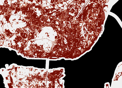
Using the land use indicator, the forest and green dimension of the island is fully apparent.
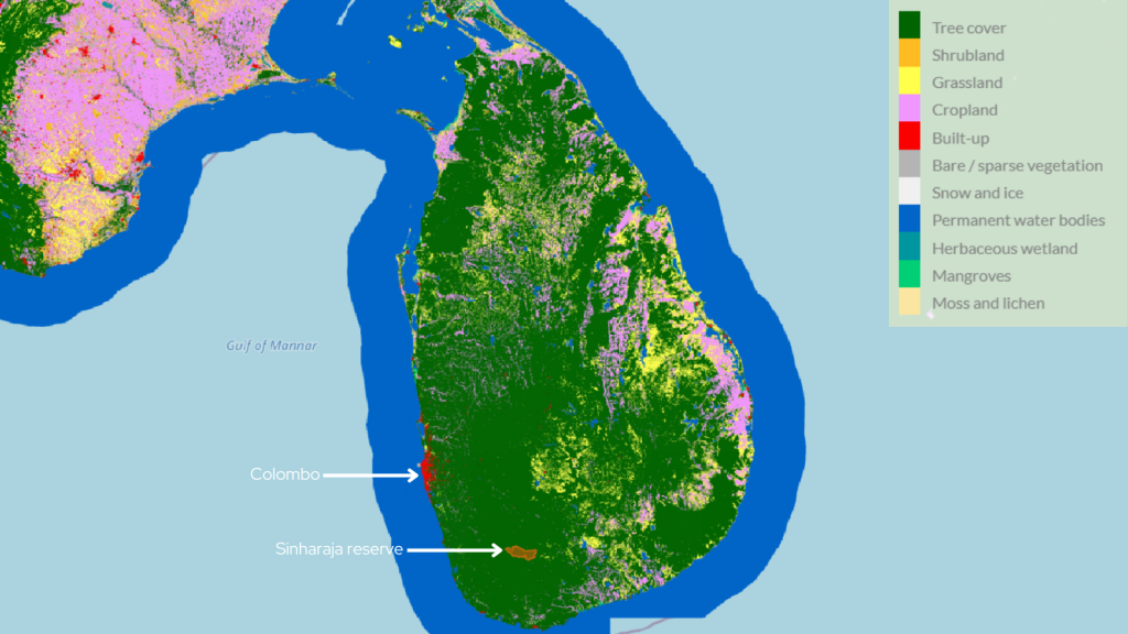
(Land Cover Indicator Map of Sri Lanka, 2020, ©Murmuration)
First of all, we can see that most of the island is covered by trees (in green). It can also be seen that arable land covers a significant part of the eastern part of the country. Finally, the land use indicator highlights the presence of urban areas (in red), the most important being Colombo in the west of the country.
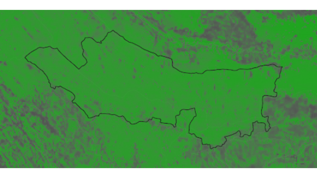
The Sinharaja Reserve has been a UNESCO World Heritage Site since 1989. It is considered the last viable area of primary rainforest in Sri Lanka. It covers more than 8,000 hectares, in the heart of an already heavily forested region.
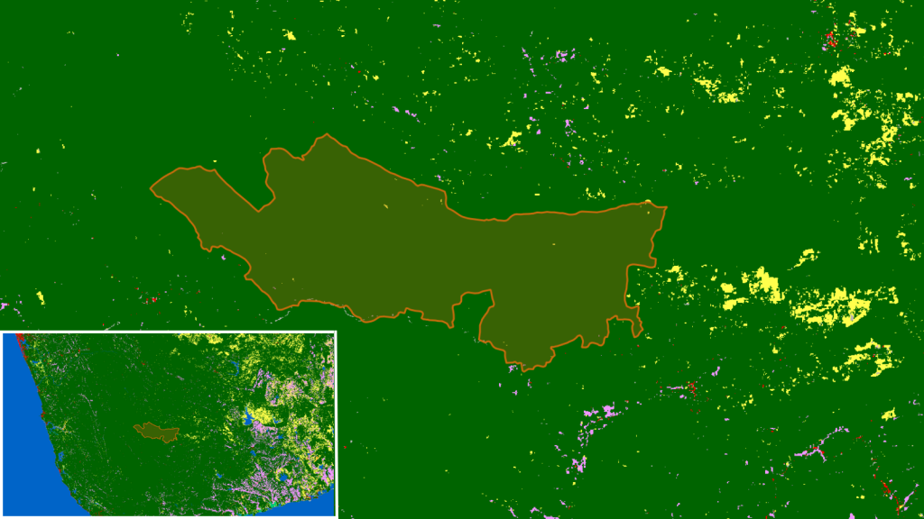
(Land Cover Indicator of the Reserve of Sinharaja, Sri Lanka, 2020, ©Murmuration)
This forest is very little altered (exclusively green area), which proves the necessity of protecting these green areas and the positive results of this protection. It is clearly visible from space that this area is almost untouched by urban construction or agricultural cultivation.
This is due in part to the status of this biodiversity area as a UNESCO World Heritage Site. It also benefits from real protection by the Sri Lankan public services. Finally, it also benefits historically from the lack of road access to the reserve.
We are therefore in the presence of an authentic primary forest, i.e. a forest composed of indigenous species where no trace of past or present human activity is clearly visible.
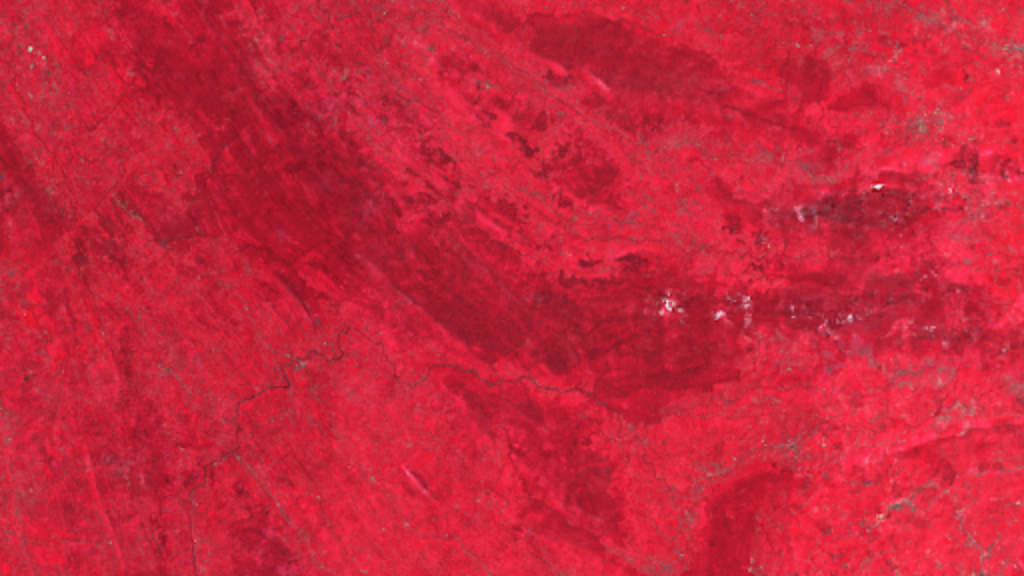
(Vegetal Cover Indicator Map of the Reserve of Sinharaja, Sri Lanka, 2020, ©Murmuration)
Focusing on the vegetation cover of the area, the Sinharaja Reserve (center, in darker red) can be clearly seen. The darker is the red, the more vegetation is present on the land.
However, as highlighted in this article, establishing the health and sustainability of a forest is not usually based solely on its vegetation density.
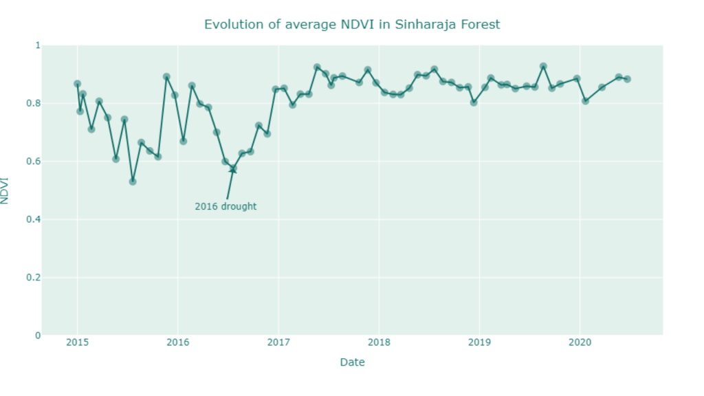
To monitor the biodiversity of the Sinharaja reserve, we used our vegetation health indicator, obtained by calculating the NDVI (Normalized Difference Vegetation Index). Based on spatial Earth observation data, it allows us to assess the content and evolution of vegetation in a territory.
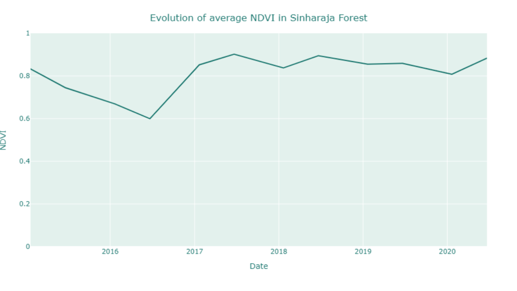
(Evolution of the Average NDVI in Sinharaja Reserve, 2 samples a year, 2015-2020, ©Murmuration)
(Evolution of the Average NDVI in Sinharaja Reserve, 1 sample every month, 2015-2020, ©Murmuration)
The graphs above show the evolution of the average health of the vegetation from 2015 to 2020.
Two phenomena should be highlighted:
The use of this vegetation health indicator allows the state of the green spaces to be quantified precisely and comprehensively. However, it is important to emphasise that indicators here are 6-month and 1-month average of a natural phenomenon that is constantly changing. In addition, there are many climatic, environmental and anthropogenic phenomena that influence the health of the vegetation.
In Sri Lanka, biodiversity is notably subject to two monsoon seasons: Yala and Maha. Yala takes place in the southwestern part of the island from May to July. This is the great monsoon, creating a very humid climate.
Maha, is the second monsoon period, on the North East coast of Sri Lanka. It usually occurs from October to January.
These two periods play an essential role in the development and preservation of Sri Lanka’s biodiversity.
(NDVI Map of Sri Lanka, 2015- 2020, ©Murmuration)
This systematic evolution of biodiversity is visible from space, by observing the vegetation health indicator during the different seasons and over several years (2015-2020).
Real variations can be seen: biodiversity evolves, moves, clusters and expands with each monsoon.
Therefore, climate change plays an important role in the evolution of Sri Lanka’s biodiversity. The lack of monsoons, or the reduction of rainy days are real factors that threaten Sri Lanka’s biodiversity.
Biodiversity must be protected at all costs, as its role is crucial in the fight against carbon and climate change.
We have previously highlighted the fact that the Sinharaja reserve is a primary rainforest. This is of particular importance for understanding the role of biodiversity in the fight against climate change.
Our carbon sequestration indicator allows us to highlight the role that a primary forest such as Sinharaja plays in this phenomenon.
(Carbon Sequestration Indicator Map of Sinharaja Reserve, 2020, ©Murmuration)
This indicator makes it possible to determine the quantity of carbon sequestered by the reserve, in this case 1 million tonnes of CO2 sequestered per hectare. The reserve is clearly visible in this image.
The green colour represents the areas sequestering carbon, the more intense the colour, the greater the quantity of carbon sequestered. In contrast, grey represents areas where little carbon is sequestered.
To put it another way, the forest of the Sinharaja reserve alone retains nearly 9 billion tonnes of carbon. By comparison, the annual carbon output of global aviation is approximately 660 million tonnes of CO2/year.
If this figure seems so high, it is essentially due to the age and preservation of this area of biodiversity. Virtually untouched by human disturbance, the forest has been able to accumulate a gigantic amount of carbon from its birth to the present day.
The forest absorbs carbon from the air and transforms it into branches, leaves and all forms of vegetation. In doing so, the forest absorbs CO2, retains the carbon for its development and releases O2 into the air. This phenomenon, called photosynthesis, is the source of carbon capture by forests.
It is therefore important to emphasise that the Sinharaja reserve does not consume nearly 9 billion tonnes of carbon per year, no, it is made up of carbon!
This forest has absorbed all this carbon since the beginning of its existence (which can represent several thousands or even millions of years), but it does not disappear, it is present in the wood of the trees.
In the course of these analyses of biodiversity in Sri Lanka, and in particular vegetation, several threats to the Sri Lankan environment are observed.
Firstly, the ultimate need to protect the Sinharaja reserve, in order to avoid any release of carbon into the atmosphere. This is already very difficult to control today, and any further release is a step backwards in the fight against climate change.
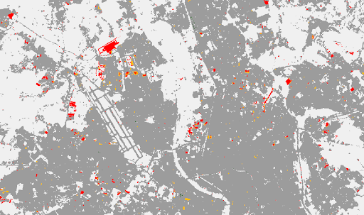
The territorial protection of the reserve is of great importance as it is subject to many pressures, be they urban, economic and/or social.
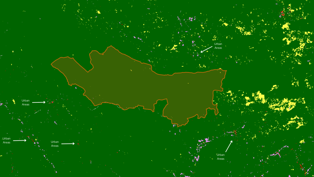
(Land Cover Indicator Map around the Sinharaja Reserve, Sri Lanka, 2020, ©Murmuration)
The reserve is confronted with urban pressure and the phenomenon known as “urban sprawl”. Indeed, towns are taking up more and more land and people are settling ever closer to natural areas. As can be seen in this map, some small towns are not far from the reserve and are already taking land from the forest around them.
In order to meet human needs for access to work and health care, Sri Lanka has built new roads, which are coming dangerously close to the Sinharaja reserve, and in some cases already threaten the reserve.
These roads are being built to give residents easier access to services that are only available in the larger towns.
Although the construction of this road is motivated by important human needs/necessities, it is important to measure its immediate impact on nature, but also those to come, which are also called negative externalities.
Indeed, the construction of a road will not only have environmental consequences of the construction, but also of the use of the road. We are talking here about the traffic to which these roads will be subjected, and therefore the penetration of polluting vehicles as close as possible to the nature reserve.
Finally, these roads can also be diverted from their basic principle and used for profoundly anti-environmental economic purposes. The opening of such roads increases the number of access points to the forest and thus facilitates access to illegal exploitation of the forest and illegal resource extraction.
To combat these negative externalities, several solutions can be envisaged.
Firstly, constant monitoring of the forest (in particular through the use of satellites). Secondly, increased funding for the protection of the integrity of the forest, including the addition of staff to monitor and punish infractions.
The financial contribution of tourism, attracted by this reserve, can and should be a source of funding for the protection of Sri Lanka’s biodiversity.
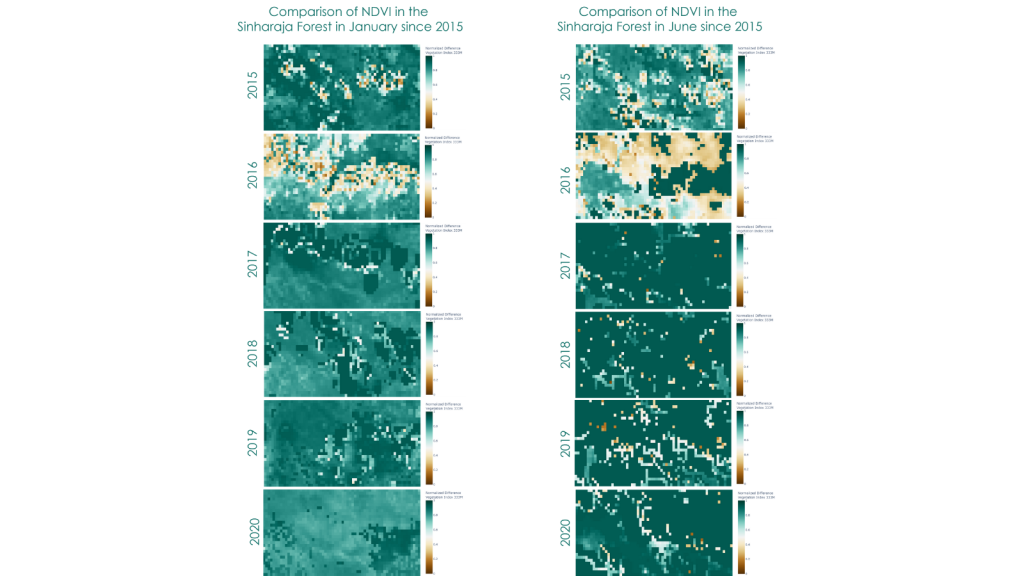
(Comparison of NDVI in the Sinharaja Reserve , in January and June, 2015-2020, ©Murmuration)
As can be seen from these images, the vegetation cover came to a considerable halt in 2016.
This year was known to be one of the driest on record. The major consequence of this drought, which can be seen regardless of the season, was the regression of the vegetation space in the reserve.
This phenomenon has been observed in several places around the world. It shows the extreme vulnerability of plant areas to climate change.
This environmental phenomenon raises a series of questions concerning the struggle of state and social actors against international and climatic phenomena.
In addition, such events underline the importance of the need for a global effort to combat global warming, which directly threatens the world’s biodiversity, our forests, our oceans, and consequently the air we breathe.
The protection of the biodiversity is now more than ever a major concern of human’s health and future.
Sources : Copernicus Programm
Authors : Maël Plantec, Camille Lainé, Muruguesh Manthiramoorthi, Fabien Castel, Rémi Nassiri
Big cities keep on growing, it is important to monitor this development process, and that’s why Murmuration created its own Urbanisation Indicator. As a result of technological progress, humanity is constantly expanding its urban territory. This phenomenon of urbanization leads to an artificialization of the soil and poses three major problems:
Nowadays, three solutions exist to answer these problems :
Murmuration proposes an Urbanization indicator, built from satellite data. Today, a city or a village is quite capable of determining the evolution of its urbanization without using spatial data. However, it is at a more global scale that the task becomes more complex. Indeed, for a region or a country to be able to calculate the evolution of its urbanization, it would be necessary for all the sub-communities to gather their data together.
The Urbanization indicator is an observation tool that allows the visualization of land artificialisation in a given area of the world at a given time. It also allows to study its evolution between two years. To better understand how it works, here are two images.
(Urbanism map of Lisbon, 2018, ©Murmuration)
This is an image representing the density of land taking process in Lisbon in 2018.The accuracy is 10 meters. The density is calculated as a percentage. The darker the area is red, the higher the density of land taking process. Conversely, the lower the density of an area, the more it will be represented in light red, until it becomes white if the area is not artificialized.
(Evolution of land artificialisation in Toulouse between 2015 and 2018, ©Murmuration)
Finally, this image represents the evolution of land artificialisation of a part of the city of Toulouse between 2015 and 2018. The accuracy is 20 meters. the areas in dark gray t have not evolved between the two periods. In red and yellow, are the areas where we built. In green, these are the areas where the artificialization has decreased (creation of park, destruction of building, …). Finally, in white, these are the undeveloped areas.
To operate, the indicator uses three different databases. The first is from the Wekeo service. This company offers Copernicus data for free download, including all Sentinel satellite data, contributing missions and Copernicus marine, terrestrial, atmospheric and climate services. We can find the data of soil impermeability in Europe with a precision varying between 10 and 100 meters depending on the selected options. These data are present every 3 years, from 2006 to 2018 and are accompanied by data showing their evolution over the same period.
However, this service only offers soil impermeability data in Europe. This is why we use a second database from the Copernicus Global Land Service. This organization offers data displaying the built-up areas in the world, from 2015 to 2019, with a precision of 100 meters. We can then calculate ourselves the evolution of these areas between each year.
Finally, for the most recent years and for a worldwide observation, the database from the World Cover service is used. WorldCover provides a new reference product for global land cover at 10m resolution for 2020, based on Sentinel-1 and 2 data that have been developed and validated in near real time and at the same time maximize the impact and usability for end users.
To better understand the usefulness of such an indicator, let’s see how we can study the evolution of urbanization in Occitania in relation to the objective “Net Zero Artificialization” (NZA).
This objective in France aims at limiting the increase of the impermeability of the soils in order to reach a zero growth in 2050. Thanks to the urbanization indicator, we can see that the Occitanie region has experienced a growth of 3.4% between 2015 and 2018.
Even though such growth seems to show that the ZAN goal is not met, it should be understood that the region is one of the most attractive in the metropolis, with a population growth of 3.5% between 2013 and 2018 according to INSEE.
In order to evaluate the achievements of the Net Zero Artificialisation’s objectives, Urbanisation Indicator seems to be the most adequate. It allows a larger time and space analysis.
On the other hand, it can be seen that urban growth is difficult to compensate. When a natural area is artificialized, there is little chance that it will return to its original state.
Indeed, between 2012 and 2018 only 0.01% of the artificialized territory in Occitania has undergone a significant decrease in its imperviousness.
Finally, it is interesting to study the impact of major cities on the increase in net land artificialisation in Occitania between 2015 and 2018. Toulouse, which is the region’s capital, alone absorbs 8.2% of all urban growth while constituting only 4.87% of the urban area in Occitanie.
Montpellier, which is the second largest city in the region, absorbs 3.2% of all urban growth, while it only constitutes 2% of the urban area in the region. One might therefore think that the metropolises act as catalysts for soil artificialisation.
However, these are the same cities that have the highest density in the region and therefore limit urban expansion to a maximum. The large cities therefore have a double-edged impact on land artificialisation.
Thus, it is important that the city councils of these metropolises continue to develop their urbanization while applying the three methods for limiting the net artificialisation of land: avoid, limit and compensate.
The quality of air around the world is deteriorating, it is a well-known fact, and still too few people acknowledge it as the need of the hour. This article explains how Murmuration contributes in helping to combat this issue. Murmuration is a French SME created in March 2019 with the aim of introducing the environmental dimension into the decision-making cycle, focusing on tourism management institutions and stakeholders. We are using mainly earth observation satellite data, mixed with in-situ and socio-economic data.
Murmuration has developed ready-to-use indicators based on the prior mentioned data sources. Among them, the air quality indicator aims to provide insights on the evolution of major air pollutants across the globe for comparison and evaluation purposes. The indicator follows standards for data production and dissemination, such as the Open Geospatial Consortium (OGC) standards. It makes it ready to use for most of the client applications. The main objective is to help policymakers and other stakeholders identify problems at their root so that actions can be made accordingly.
The quality of air has been deteriorating since the beginning of the industrial revolution. Toxicity of the air is higher than ever before. In order to control it, it has to be monitored systematically. To do so, the World Health Organization started to establish Air Quality guidelines in 1987 to define safe levels of the air pollutants. The latest revision published in September 2021 defines six compounds as the primary air pollutants because of their significant effect on human health. It includes 4 gases (NO2, SO2, CO and O3) and 2 dust particles (PM2.5 and PM10). Each of these compounds affect human health in several different ways.
Through its air quality indicator, Murmuration aims at helping even non-experts understand the situation. The indicator studies air pollution at the level of individual compounds as well as an aggregated score including all pollutants.
The nature of the indicator and the algorithms used are explained in the following sections. The data used for computing the indicator comes from the TROPOMI instrument of the Sentinel 5P satellite.
But why using satellite data when air pollution has been monitored using ground sensors for a long time? The conventionally existing measurements based on in-situ sensors are very local to the region of measurement (say 50 m). This cannot be used to monitor the whole city unless these in-situ sensors are installed in every place in the city. But, it is a very costly process and has to be maintained consistently.
This is the place where satellite data comes to play. Even though there is a tradeoff with the spatial resolution, the data helps studying the air quality at the city level. Satellites monitor air quality at a much cheaper cost, in a scalable way (once launched and flying, it can monitor many cities with no additional cost) and are producing measurements that can be compared from one city to another making it a very good tool for evaluating and benchmarking cities with each other.
Sentinel 5P is the first sentinel satellite to monitor the atmospheric composition. The instrument measures solar light in the ultraviolet and visible, near-infrared and shortwave infrared spectral bands. The light is split into different wavelengths using a grating spectrometer and they are captured accordingly by four different detectors to measure the level of different compounds.
The raw data from Sentinel 5P is then processed, validated, georeferenced and made available for ease of access through Copernicus Atmosphere Monitoring Service (CAMS). The processed and validated data for all of the 6 above mentioned compounds are used to calculate the indicator. The 6 individual compounds are available every day at an hourly level. Daily levels are then computed with aggregation algorithms reflecting the health impact (short term or long-term ) of each pollutant (based on WHO guidelines). The aggregated data is then fed over a data transformation pipeline to be converted to the desired format.
The aggregated air quality indices are calculated at 2 different temporal levels – yearly and daily. Two different algorithms are used to arrive at the indices :
The indexes are defined at two different coverages – European and Global. This is the result of availability of raw data of Global coverage at 0.1 ° (appx. 100 km near the equator) spatial resolution and raw data of European coverage at 0.01 ° (appx. 10 km near the equator) spatial resolution. The raw data for European coverage are readily available as mass concentration in µg/m3 which is the standard used by WHO to evaluate air quality levels. On the contrary, the raw data for global coverage is not readily available in the standard format.
In the global coverage data, dust particles such as PM10 and PM2.5 are available as mass concentrations in kg/m3 which can be converted using a conversion factor. But the gases like NO2, SO2, CO and O3 are available in mass mixing ratio in kg kg-1. They have to be converted to mass concentrations using ideal gas equations. Finally, all the gases and dusts are available in mass concentrations with the same unit µg/m3.
At the end, Murmuration’s Air Quality Indicator can be used from 2 channels that Murmuration is providing:
While the map service takes care of studying the distribution of various compounds and its hotspots, the programmatic interface helps in narrowing the study to any particular area of interest and to study the change over a temporal scale.
The indicator helps in identifying problems such as pointing out regions or times of high pollution or temporal range of high pollution exposure. The World Health Organization estimates that air pollution causes 7 million premature deaths per year. This is one of the biggest environmental threats to human life. By finding out regions of concern, appropriate actions and measures can be taken by government bodies, enterprises and non-governmental organizations to mitigate the situation.
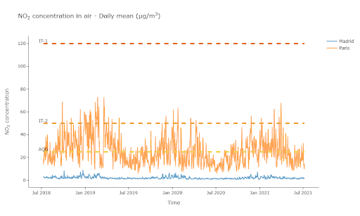
(Graph of NO2 concentration in the air in Paris and Madrid, ©Murmuration)
The above chart shows the Murmuration NO2 indicator and its evolution in Madrid and Paris over a three-year time frame.
Thanks to the indicator developed by Murmuration, it is possible to study the air quality level at the city level in a cost-effective manner. Monitoring air quality using satellite measurements will not completely replace the in-situ measurements. They act complementary to each other. While satellite measurements help in monitoring air quality at city level or higher, in-situ measurements help in monitoring air quality at street or neighborhood level (hospitals, schools, parks etc.).
This article is one among many that will be published until the end of March, explaining what Murmuration’s indicators are and their purposes.
Author : Murugesh MANTHIRAMOORTHI, Remi NASSIRI
As a UNICEF report reminded us this summer, the lack of water in some parts of the world is having serious consequences for people. This lack of access to water for populations is commonly referred to as “water stress”.
Today, several regions of the world are suffering from water stress. According to the World Resource Institute, 17 countries have an “extremely high” probability of water stress. These include India, Mexico, parts of China and, above all, most of the Near and Middle East.
This article aims to provide a better understanding of this problem and the issues involved. It also shows the role that technological and scientific progress can play. They will allow better understanding of causes and consequences of water stress in threatened regions.
The lack of water for populations can result from political and social causes: waste of available resources, mismanagement, conflicts. This makes it impossible for entire populations to access water. But it is also linked to economic problems of resource distribution and the uses addressed.
Finally, water scarcity is also and above all the result of physical causes, indeed, in the desert there is generally a lack of water, whatever the management policy put in place.
If the focus is on these physical aspects of the problem, the concept of water stress can be summarised in a few simple and understandable equations:
Reserves = groundwater + surface water + precipitation
Consumption = agricultural use + industrial use + domestic use
Water stress=Consumption/Reserves
Water stress is therefore the ratio between consumption needs and water reserves. If the need exceeds the quantity of water available in a given area, then that area is under water stress. The need includes all the uses of water: agriculture, industry and current consumption of the populations. Availability includes accessible renewable water reserves: surface water (lakes, rivers, etc.), groundwater and rainfall. The higher this water stress ratio, the greater the competition between uses and the greater the need for informed arbitration.
The need to arbitrate between different water uses requires effective monitoring tools. Observing both the state of available reserves and the level of consumption. Water stress indices are being developed for this purpose. One example is the initiative of the World Research Institute, a non-profit scientific organisation based in Washington. WRI researchers have developed a water stress monitoring index and an online platform to disseminate this information.
The following illustration, taken from this platform, highlights the situation in the Near East. The region, once known as the “fertile crescent”, saw the emergence of agriculture more than 5000 years before our era. Today, it is one of the most water-stressed regions on the planet.
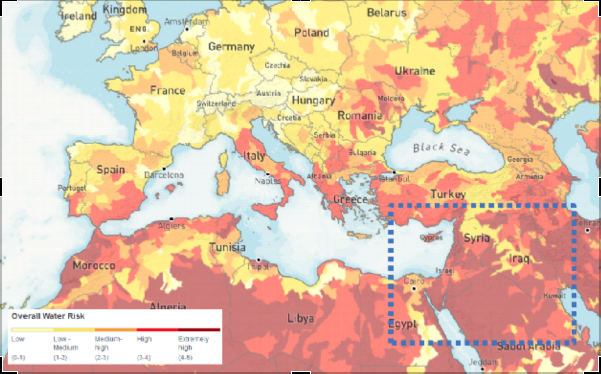
(WRI Water Stress Index Map of Europe and the Middle East, 2019)
These means are first of all extremely useful for better quantifying the available resources. Large-scale monitoring of surface water, for example, is addressed by the SWOT satellite, which will be launched jointly by CNES and NASA in 2022. This programme will make it possible to obtain consistent time series that are essential for current resource management. In addition, the monitoring of extreme events such as droughts or floods will be carried out. The Copernicus programme and its Sentinel satellites also monitor important water cycle variables such as evapotranspiration and soil conditions. In particular, the moisture in the top few centimetres of soil can be measured by the radar sensors on Sentinel-1. This is an important indication for understanding the infiltration of precipitation into the soil and modelling the state of groundwater resources.
Spatial data is also a great tool for assessing consumption needs. Large-scale land use and segmentation information from space-based observations is an indispensable basis. Sentinel satellites, for example, allow precise identification of crop type, and thus improve water use models for agricultural needs. Domestic needs can also be modelled on a large scale using urbanisation monitoring information.
These modern means of observing our planet will make it possible to set up a large-scale water stress indicator. It will be less dependent on local in-situ data that are sometimes difficult to acquire. The use of this type of data should also make it possible to obtain an indicator with a high update frequency. The revisit period of a given geographical area of the satellites considered (between a few days and a month) should make it possible to set up an indicator capable of better capturing the dynamics and evolution of water stress over time.
The integration of space observation as a tool for combating water stress therefore seems promising. It allows the monitoring of surface water, the modelling of underground resources and a better understanding of consumption. As a result, it has a real role to play in planning access to water.
This tool was actually used in 2004 during an operation in Darfur (Chad). Space observation made it possible to propose a map of the possible groundwater available in a region hosting numerous humanitarian camps. The camps were then able to use this information to set up their camps and dig wells. In this way, they are making it easier to access water.
It should be noted that at that time this international initiative used data provided by Japanese (JERS-1), American (Landsat) and European (ESA’s ERS-1 and ERS-2) satellites.
Today, the Sentinel fleet (in particular the Sentinel-1 radar tools) and the mass of free and open data that the Copernicus services produce thanks to them are favoured and should make it possible to move this type of use from research to operational services.
Authors : Fabien Castel, Rémi Nassiri
The IUCN (International Union for Conservation of Nature) stated that “plastic pollution is the most widespread problem affecting the marine environment”. Most of this pollution ends in the plastic oceans.
Plastics take centuries to degrade and contaminate the entire food chain. Each year, up to 13 million tons of plastic end up in the oceans because it is not recycled. Current estimates indicate that there is about 150 million tons of plastic found in the ocean. In 2018, the UN environment program placed the issue of plastic in the ocean among the six environmental emergencies of greatest concern.
Active methods of plastic removal are required to address this issue. Being able to detect and track plastic litters is crucial to enable these methods. There are three main approaches to track them: numerical modelling, in situ observation and earth observation satellite images.
Most of ocean plastic comes from rivers. Knowing the main points of origin and using data on ocean currents and on vertical mixing of water layers, it is possible to model the probable trajectory of plastic litter and the areas where they will stagnate and concentrate. The Copernicus Marine Service provides ocean current models that are used for this purpose.
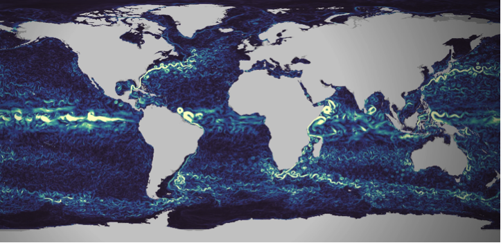
Figure 1 : Visualization of Copernicus Marine currents numerical models, extracted from https://myoceanlearn.marine.copernicus.eu/
Local measurements are regularly performed to understand and quantify the issue’s importance. With statistical processing of the collected data, these measurements campaigns allow to build and calibrate the plastic litter tracking models (see for instance van Sebille et al.).
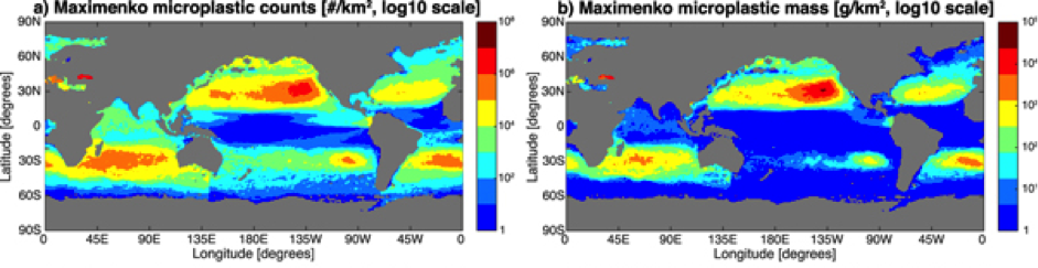
Figure 2 : Maps of microplastic count (left column) and mass (right column) distribution for one of the studied statistical models, extracted from the work of Van Sebille et al.
99% of ocean plastic lays at the bottom of oceans, whereas only 1% floats on the surface. Remote sensing from space therefore suffers from a structural limitation that will never make it a self-sufficient solution to the problem. However, with their ability to cover large et inaccessible areas, using satellite images is an innovative approach that can complement modelling and in-situ observation. While still at the research and development stage, many research groups carry out experiments. They have to work with the tools at their disposal, which are not initially designed for this task.
The European Earth Observation Copernicus program offers different options here. First is the satellite Sentinel 3, dedicated to ocean observation. It is though designed to monitor large-scale oceanic processes. Its 300 meters resolution does not make it an adequate tool for plastic monitoring.
The Sentinel-2 satellite is an interesting alternative. It provides images in the visible part of the spectrum with a 10 to 20 meters resolution. Small pieces of plastic are not noticeable. However when they aggregate into large clusters they become more likely to be detected by satellites with such spatial resolution.
Sentinel-2 has been studied as a solution to ocean plastic monitoring by many research groups (see the work performed by a group from 25 different institutions, or this work carried out by a group from the Plymouth Marine Lab in 2019). However It has been initially designed for land monitoring. While its orbit covers all the earth, images are not collected on the wide open ocean areas. Images are only available on continental coastal areas and around islands. It is still though a very interested approach showing interested results in the covered areas.
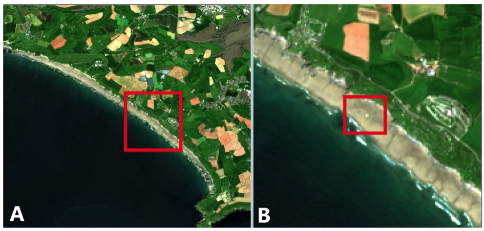
Figure 3 :Example of plastic detection on a coastal are using Sentinel-2 images. Extracted from the work of the Plymouth Marine Laboratory
Earth observation satellite programmes mainly focus on land. Coverage of the oceans is limited to the observation of global phenomena, with a relatively low resolution (~300m).
Higher resolution observations are available over coastal areas.
However, most plastic waste is deposited on the ocean floor. It is therefore not observable by satellites. Those that remain on the surface can accumulate in clusters visible from space.
Observation from space should be considered as a complementary solution. It can be used to detect plastic waste in coastal areas before it is dumped.
Earth observation is thus a useful data source for flow analysis and waste tracking models. It provides a wide and systematic spatial coverage that ideally complements the more accurate but local and punctual in-situ observations.
Finally, it is important not to stop thinking about the role of space observation in ocean pollution control. Indeed, satellites are evolving, and so are observation tools. Improved resolution could allow for more detailed observation of plastic waste in the oceans. Going from 300 m resolution to 20 m with global coverage of the oceans would be a major advance. This would make it possible to position space observation at the centre of the tools and means for sustainable action in the oceans.
Setting up this type of mission takes time, but the plastic crisis in the oceans could lead space observation down this path.
Authors : Fabien Castel, Rémi Nassiri
A fortnight ago, the World Health Organisation (WHO) published an update of its air quality guideline. This has not happened since 2005. Therefore, this is a major scientific and societal event. The need for air analysis to evolve in line with technological and scientific advances pushed for this intervention. Moreover they demonstrate the highly dangerous and damaging effects of poor air quality on human health.
Indeed, the WHO estimates that air pollution causes 7 million premature deaths. But it also means millions of years of lost life expectancy.
Air pollution is highly dangerous for our health and our planet. This is why the WHO has drastically lowered the air quality thresholds. Because at this level, they reveal the danger of elements present in the air, even in smaller quantities.
This intervention also sounds the alarm. Thus, the international organisation alerts the authorities for the need to act more quickly and effectively against air pollution.
Air quality has a direct impact on human health (UN Sustainable Development Goal 3, Good health and well-being). In addition, it has serious consequences for the environment in general (UN Sustainable Development Goal 15, Life on Earth). Various chemical compounds emitted by human activities alter this air quality.
Particularly noteworthy is fine particle pollution. This is aggravated by various anthropogenic factors (industry, heating, building sector, transport and road traffic). It causes respiratory diseases, cardiovascular problems and complications in infants.
Nitrogen oxide (NOx) pollution covers another dimension of the problem. It leads to acidification of precipitation, which alters soils and waterways, unbalancing many ecosystems. These pollutants are mainly emitted by road traffic. Moreover, they can travel long distances from their place of emission and affect sensitive ecosystems. Consequently, the limitation of these emissions in areas with heavy road traffic (i.e. urban areas) is mainly a health issue. It is not only a local one but also a global one, in order to preserve our common environment.
The thresholds defined by the WHO were lowered between the last version of 2005 and the recent update. This decision is justified by extensive epidemiological research. The results obtained on a large scale in recent years are worrying. They reveal the significant long-term impact of these pollutants, even in small doses. For fine particles, the threshold value has been divided by 2. This translates into a reduction from 10 µg/m3 in 2005 to 5 µg/m3 in 2021. For NO2, the strengthening of the directive is even more important. The threshold has been reduced from 40 µg/m3 in 2005 to 10 µg/m3, thus being divided by 4 today.
Modern Earth observation tools make it possible to monitor the concentration of pollutants in the air from space. This is made possible and accessible by the European Copernicus programme, and in particular the Atmosphere service. From observations collected by the Sentinel 5 satellite, scientists and engineers produce daily data.
These data cover the whole world. They provide an objective, high-level measure (average value aggregated over a 10-kilometre resolution grid) of air quality. They can be used systematically anywhere in the world, and are therefore an invaluable analytical tool.
Comparing, for example, the emissions of several large European cities, we can already see the differences. With the new WHO recommendations, we can see that some cities stand out. Among them, Spanish cities are among the best.
The following graph focuses on the concentration of nitrogen dioxide (NO2) in the air. Here it focuses on 4 European cities over the last 3 years. The cities are Madrid, Bilbao (in red and blue), Athens and Rome (in yellow and green). The orange line represents the WHO recommendation.
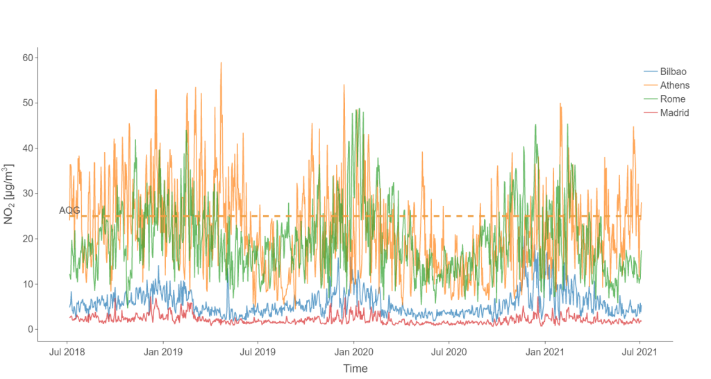
(Graphique des taux de concentration de dioxyde d’azote (NO2) dans l’air, pour les villes de Athènes, Bilbao, Madrid et Rome)
This comparison between southern European cities clearly shows the difference in NO2 pollution. Cities like Rome and Athens are well above the new WHO framework. In contrast, Madrid and Bilbao remain well below.
The situation for fine particles is relatively similar. Indeed, Madrid and Bilbao are both below the WHO thresholds. These observations are illustrated by the graph below (using the same colour code as above).
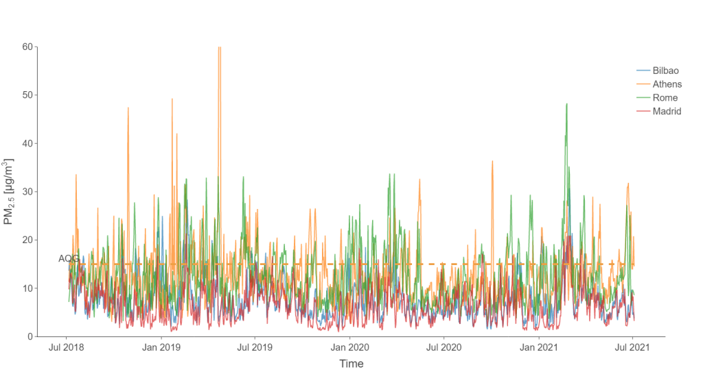
However, over the last 3 years, Madrid and Bilbao have had average levels below the limits set. As for the peaks, they remain much lower than those of the other cities. As a result, air pollution in these Iberian cities is much lower than in Rome or Athens.
So what can explain such a low level of pollution in these Spanish cities? The answer surely lies in the road traffic regulation measures taken by the cities in recent years. Madrid introduced large low-emission zones in the city centre in November 2018. In Bilbao, the speed of vehicles in the city centre has been restricted to 30 km/h since May 2018.
Finally, the data collected on site tends to prove these Spanish cities right. To demonstrate this, in-situ sensors are used. These allow the evolution of nitrogen dioxide pollution to be followed over a long period. The following curve shows the evolution of the nitrogen dioxide pollution index of the World Air Quality Index in Bilbao.
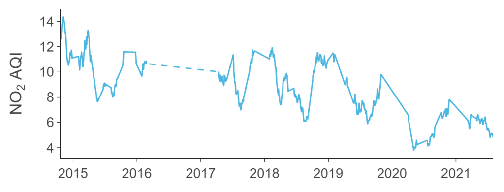
The downward trend is clear in 2020, but should be taken with caution. In this period, the health crisis also had a strong downward impact on emissions.
However, it continues strongly into 2021, which is a very encouraging sign.
Moreover, this could quickly confirm the lasting positive effect of efforts to regulate road traffic in urban areas. There is therefore great hope for the consequences and success of similar measures in other European cities.
Authors : Fabien Castel, Remi Nassiri
The term “Murmuration” describes the phenomenon by which starlings gather spontaneously in the air to face a predator. Faced with the exponential growth of mass tourism and its negative effects on the environment, MURMURATION SAS’s approach is similar: to create an ecosystem of engaged actors from the tourist sector to quantify the environmental pressure on popular destinations and to limit its impacts in the context of climate change. It aims to create better conditions for the development of a sustainable tourism!
October 2018, the Philippines reopen Boracay, a paradise island previously soiled by mass tourism. December 2018, the famous Thai island Koh Phi Phi lacks water because of the number of tourists. April 2019, Dubrovnik tries to manage the overtourism. June 2019, deaths on the slopes of Everest increase because of overtourism …
Many stories like those ones demonstrate the effects of mass tourism. Over-frequentation? Bad tourism management? In any case, prevention is better than cure. While tourism accounts for 8% of global greenhouse gas emissions (according to the Allenvi 2019 study), it is also a socio-economic catalyst and a factor in preserving the environment through the development of new trends such as sustainable tourism.
All the stakeholders have to help safeguard the places that make us dream during our travels. Tourists, tourism professionals, local authorities, associations and NGOs, governments, … All must collaborate so that the tourism activity can be a real promise of economic and social development, while preserving biodiversity and local life in a sustainable way.
Study case : Bali, a tourism booming. How to deal with environmental pressure?
This inclusive approach is possible thanks to satellite data. Combined with various data from local authorities or even the tourists (eg tourism statistics), this innovative solution aims to set up environmental pressure indicators on a global scale. Indeed, the observation of a dedicated area thanks to high-resolution satellite data allows to give reliable and transparent indicators. The satellite data are factual and invaluable because they allow to go back in time, to identify the problems but also the solutions and to foresee future evolutions.
Copyright image : rawpixel de Pixabay
Satellites offer us an incomparable view of our planet thanks to spatial data
(more…)